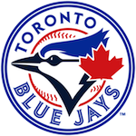
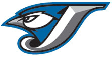
Batter's Box Interactive Magazine Batter's Box Interactive Magazine Batter's Box Interactive Magazine


I'm a baseball traditionalist. I'd prefer to see the next Toronto playoff team look like the one that won two World Series. I'm against cash grabs, and fixing stuff that ain't broke, so don't expect a rave review. I wasn't consulted, anyway. When the Jays, the team formerly known as Blue, were doing their marketing surveys, they took one look at this grey-haired middle-aged dude with a large belly and a large beer and said, "not our demographic."

According to the press release it's a "dynamic" look. I'm sure it is, but I hate the lettering; middle-aged eyes take at least three blinks to figure out what the hell it says.

The bird is a big improvement, an authentic Fighting Jay. I like him.

Better Than The T-Bird | 70 comments | Create New Account
The following comments are owned by whomever posted them. This site is not responsible for what they say.
Coach - Tuesday, September 02 2003 @ 09:03 PM EDT (#92856) #


This will make a great cap.
_StephenT - Tuesday, September 02 2003 @ 09:20 PM EDT (#92857) #
I find most sports caps aren't made big enough. e.g. I bought a true logo Jays cap in Seattle a couple years ago (couldn't find them in Ontario), it says it is size 7 3/8, but I find it too tight for comfort. (No, I don't think I have a big head :-) ).
_Donkit R.K. - Tuesday, September 02 2003 @ 09:32 PM EDT (#92858) #
I agree wholeheartedy with the Coach. I, with my 17 year old eyes, have trouble reading what that says (off of a less than stellar computer monitor anyway). I also love the logo Coach has in the first post. The 'Fighting Jay' with the one letter is as close to the New York NY or the Boston B as we'll get. Now, I just have to see the actual jerseys....

BTW, the thought of a black jersey still makes me cringe.
_Rich - Tuesday, September 02 2003 @ 09:44 PM EDT (#92859) #
I actually think it's a significant improvement on the current logo, and getting rid of the red suits me. I agree that black jerseys for a team called the Blue Jays is ridiculous. Mind you, I happen to think that any baseball jersey that ain't white or gray is ridiculous.
_Matthew Elmslie - Tuesday, September 02 2003 @ 09:44 PM EDT (#92860) #
Me, I kinda like it. I don't have a lot of demands when it comes to logos and caps and uniforms; just pick something halfway decent and stick with it. This one is more than halfway decent, and the stupid musclebird was less.
_Brent - Tuesday, September 02 2003 @ 09:54 PM EDT (#92861) #
It's been a crazy week over here in London, and I'm glad to find a much improved logo on my way back to the 'Box. I mean, compare the two logos below the Battersbox logo. Without exaggeration, the new logo is a kajillion times better. I agree with Donkit though, the full logo seems to be a little hard to read, but my monitor also sucks so we might have found our culprit.

I'm glad to be back around here. I'll be attending tomorrow's game, so I’ll report back with details of the new merchandise they should have available.
_Jacko - Tuesday, September 02 2003 @ 09:55 PM EDT (#92862) #
http://www.panthers.com
The shade of blue is quite different from what it was before. Not sure what it reminds me of yet. I think it's the same shade of blue the Carolina Panthers use (click on link). Certainly unique within MLB.

They're going to have to do a whole lot of repainting and renovating at Skydome to make the colours match :)

Still, it's not bad, not bad at all...

BTW, am I the only fan in Toronto who actually liked the "Fighting Jay"?

Finally, smart move going with "J" instead of "T", which is already taken by the Texas Rangers.
_Chuck Van Den C - Tuesday, September 02 2003 @ 10:03 PM EDT (#92863) #
Finally, smart move going with "J" instead of "T", which is already taken by the Texas Rangers.

And Time magazine (the first thing I thought of when I saw the red T).
_Scott Lucas - Tuesday, September 02 2003 @ 10:07 PM EDT (#92864) #
I have a brand new, crystal clear monitor, and it's still hard to read "Jays." But I do like the bird/"J" combo.

Funny how the official press release on the official web site does not have a picture of the new logo.
_Spicol - Tuesday, September 02 2003 @ 10:08 PM EDT (#92865) #
I think the bird itself is great, as is the new blue colour. The lettering...not so much. I'd prefer a cap with only the bird.

The question is: Is it metrosexual?
Pepper Moffatt - Tuesday, September 02 2003 @ 10:11 PM EDT (#92866) #
http://economics.about.com
It's been a crazy week over here in London

That's an oxymoron. Unless you're talking about municipal politics.

Brent: Are you still at UWO? Could you send me your e-mail addy? (mail me at economics.guide@about.com)

Overall, I like the logo. However, I'm afraid it's "modern-ness" means that they'll have to create a new one in 5 years. I just wish they'd create a simple logo, and stick with it for a couple of generations. I swear, you could use Mr. Hankey as your logo and people would buy it 40 years from now because it became a traditional favorite.

Cheers,

Mike
Gitz - Tuesday, September 02 2003 @ 10:21 PM EDT (#92867) #
My two cents: I think the bird is terrific, the lettering less so. It reminds me too much of the Devil Rays, and we all hope and fervently pray to any god ever imagined that the Jays play better than Tampa.

Yeah, I guess Coach thinks the same way, which isn't too surprising, since I basically think the same way Coach does on, well, everything, confirming my suspicion we were in some way separated at birth, despite our disparate ages. (I'm 33, Coach is a young 50.) Fortunately for Coach's sake he doesn't always think the same way I do; there's a subtle difference there, at least to this nuanced fool.
_Ryan - Tuesday, September 02 2003 @ 10:22 PM EDT (#92868) #
Sportsnet briefly showed the new uniforms. They looked blank, outside of the markings on the front. No piping or arm patches as far as I could tell. I have to wonder if they were the ones we'll actually see on the field next year, or if they were just preliminary samples.

It's "Jays" across the front of the home uniform and black alternate. "Toronto" is across the charcoal grey (or whatever they want to call that colour -- at least it isn't powder blue) road uniform.
_BJ Birdy - Tuesday, September 02 2003 @ 10:24 PM EDT (#92869) #
I don't find the word "Jays" at all hard to read, but I like graf writing, so this is child's play. :)

I like this. The caps are going to be sweet.
_Rob Andrew - Tuesday, September 02 2003 @ 10:46 PM EDT (#92870) #
I haven't seen the full uniforms, but the logo looks great. I like the bird, I like the colors, and I like the 3D-shaded lettering.
_Donkit R.K. - Tuesday, September 02 2003 @ 11:06 PM EDT (#92871) #
I have to say, the lettering does look cool. It just took my eyes a couple of tries to read what it said. The logo as a whole is growing on me already and I love the simple logo Coach proposed for the cap (and the logical choice for the cap). The final decision on whether or not this gets a passing grade will be when I see the final jersey. I think red stitching/piping would be nice on the black jersey though. It definitely shouldn't be as blank as Ryan describes, and red accents on black is always easy on the eyes.
_pete_the_donkey - Tuesday, September 02 2003 @ 11:08 PM EDT (#92872) #
I agree with Spicol - I think the cap would be WAY sharper if it was the bird head only, no letter J. Much cleaner, classier. LOVE the new Blue - I was never a fan of the current blue, way too 'crayon-ish'. HATE the font - even my 27 year-old eyes can't focus on it immediately - makes my brain hurt. REALLY hoping the new jerseys incorporate the piping around the neck and down the sides of the buttons flaps as per the current jerseys - I like that retro-touch. VERY glad to see we didn't go pinstripes.
_Jonny German - Tuesday, September 02 2003 @ 11:27 PM EDT (#92873) #
My two cents: It's better than I expected it would be, and better than the last two (and the first one wasn't a classic baseball logo either, so I'm not pining for a return to that). I don't agree with the majority that it's particularly hard to read, and I'm not convinced that even matters; the learning curve is real short, next time you see it you'll know what it says immediately. (On a related and perhaps contradictory note, am I the only one who still struggles to see the Montreal M as an M? After seeing it hundreds of times it still looks like a script "e l b" to me... but I know that it means the Expos!). The cap with the bird and just the J will be good, and a cap with just the bird would be even better. I'm thinking the jerseys will be awful, regardless if they have the logo or "Toronto" in that font. I disagree with the thought process that T was to be avoided because it's already "taken"... without going into the whole Seasame Street theme I posted the last time we discussed this, I'll just point out that C has meant both Chicago and Cincinatti for as long as I can remember.
_Jonny German - Tuesday, September 02 2003 @ 11:39 PM EDT (#92874) #
Another thought: it's possible that they could make this work real well, by de-emphasizing the full logo and promoting the Bird and the Bird/J combo as many of us have already endorsed. The case in point is the Yankees: Their linked NY is classic and simple and looks great, but their actual full logo is not classic, not simple, and looks goofy. But they use it so subtly on their uniforms (on the sleeve) that it doesn't really matter.
_BJ Birdy - Tuesday, September 02 2003 @ 11:40 PM EDT (#92875) #
I didn't realize until I was twenty-two years old that Expos logo was an "M." Nor did it occur to me that the Brewers logo contained an "M" and a "b" until well after it was jettisoned. Really, I'm not that bright.
_Ryan - Tuesday, September 02 2003 @ 11:43 PM EDT (#92876) #
I have the same problem with the Expos logo. There is simply not an "M" to be found in that thing. At most there's a badly-written "N". :-)

I took another look at Toronto's new logo and can now see how people may have trouble reading it. If read quickly it looks like the team's nickname is the Joujs.
_Simon - Wednesday, September 03 2003 @ 12:59 AM EDT (#92877) #
I don't know where the confusion is? The Expos logo is a 'e d b'. It stands for expos du baseball. That was the explanation that I recieved. Then again, expos du baseball doesn't really make sense. I think I may have heard something about expos club du baseball, and you can kind of see that if the e doubles as the c.

As far as the logo. The first thing that hit me was that it's pretty similar to the Jays. Which I don't like. It's still too contemporary for me, but I have to see the jersey's before making a final opinion. But if they just slap Jays, like they have here, on the front of it and expect good things, they're sadly mistaken.
_Jurgen - Wednesday, September 03 2003 @ 01:09 AM EDT (#92878) #
I passed by Roots at Bloor and Bay on my way to work this evening and was greeted by a huge banner with the new logo. I think I agree with most of you--great bird, less great lettering.

Not sure who was at the unveiling party. (And why Roots?) I think I saw Reed Johnson standing around, and rumours Cito was there too. Anyone got the goods?
_Simon - Wednesday, September 03 2003 @ 01:11 AM EDT (#92879) #
Excuse me that's meant to be "similar to the Rays."
_Elijah - Wednesday, September 03 2003 @ 02:35 AM EDT (#92880) #
The new uniforms are displayed as part of the "New Logo Gallery." I like the logo but the numbers look like they're from Star Trek: The Next Generation. I wonder what the back of the unis will look like with names and numbers.

I wish the caps were blue instead of black and the cap with the whole Jays logo in the front just doesn't do it for me. And I can't imagine them wearing the powder blue cap.
Dave Till - Wednesday, September 03 2003 @ 07:30 AM EDT (#92881) #
Like Elijah, I'm more concerned about what the names and numbers on the back of the uniform will look like. (The photo gallery at bluejays.ca didn't show this.) The current player names are hard to read, and take up too much space on the back - you have to swivel your head in order to read "Catalanotto", for instance. Fixing that will help big-time.

As for the logo: I think it's OK, and it serves its primary purpose, which is to sever the connection with the Interbrew/Ash era. Basically, if the team starts winning, the logo will take off; if they don't, the Jays will have to undergo another exciting new rebranding exercise in four years.
_Andrew Edwards - Wednesday, September 03 2003 @ 07:37 AM EDT (#92882) #
I like the bird and the J. The rest of the script is OK, I guess, but both ethe script and the uniforms remind me WAY to much of the D-Rays.
_Ryan - Wednesday, September 03 2003 @ 09:02 AM EDT (#92883) #
Now fashion writers at the Toronto Star are taking shots at the Jays:

\"Unlike our fine-feathered friend that just got benched, this newly minted bird seems imminently unapproachable. If they build a human-size mascot of this winged menace with piercing beak and furrowed brow, he'll send children running into their parents' arms."\

Unbelievable.
_Rich - Wednesday, September 03 2003 @ 09:04 AM EDT (#92884) #
The dark grey uni's are horrible. The squad will look a bunch of softball players. I think the whites are fine.
_Spicol - Wednesday, September 03 2003 @ 09:05 AM EDT (#92885) #
Not sure who was at the unveiling party. (And why Roots?) I think I saw Reed Johnson standing around, and rumours Cito was there too. Anyone got the goods?

There are pics on the main site. Cito was there, Ronnie Hawkins, Tie Domi, Hazel Mae, Vernon Wells, Trish Stratus and others...

I don't think the baby blue hats are part of the uniform. It is likely just an alternate hat for marketing purposes.
_Jordan - Wednesday, September 03 2003 @ 09:23 AM EDT (#92886) #
Piling on ... overall, I like the logo. The bird is good -- he looks like he's ready to dart forward and peck your eyes out, and that's a good thing to subliminally plant in your opponent's mind. Not that the 2006 Jays figure to be a dart-and-peck kind of team; by that time, they may be using a bulked-up bird in a slow-moving bulldozer. My only small complaint is that he's facing left, away from the logo. One of the many things they teach at Graphic Design Collegiate is not to run photos in which the subject is looking off the page; it distracts the reader from the story. Flip the picture if you have to, or choose another one: the focus should always be on the page. In the same way, the Blue Jay is looking in the opposite direction of the logo, pulling your eyes in two different directions (not only that, but the bird is looking backwards, into the past -- not a good implication). But I guess there's not much you can do about that; the bird was meant to be part of the "J" and that basically determines the direction he's pointing.

I can take or leave the font. I can see the similarities with the Devil Rays, but I think Tampa's logo is more stylized and curvy; the Jays seemingly have tried to make this logo a little sharper and cleaner. I see what you mean about the logo being hard to read; I think that comes from the blue "shadow" around the letters. That kind of outline should be used to support the main text, not overwhelm it, and here I think it's a little overwhelming. I would have cut back the blue edging by half, or even gotten rid of it altogether. There's already an element of shadow in the three-dimensional pointiness of the word "Jays" -- adding the blue shadow outside is just too much. I think they tried very hard to make this an impact logo, and they went too far. But it's okay.

I agree with the bird-and-J logo for the caps, and even more with the bird alone. If it's the bird by itself, I would strongly suggest turning it the other way (heh -- flipping the bird) and have it look forward, not backward. I can live without the red -- I never much liked the clumsy attempts to pump up the Canadian element through the use of red and a maple leaf. Most everyone now knows that Toronto is in Canada, so we no longer need to hit people over the head with it. And heck, even the Maple Leafs use blue and nothing else in their logo. So overall, this is fine. Like others, I hope they just adopt this sucker and stick with it till 2010; if the Chicago White Sox have taught us nothing else (and they haven't), it's that team logos and looks need to be stable over time.
_Jordan - Wednesday, September 03 2003 @ 09:29 AM EDT (#92887) #
"he'll send children running into their parents' arms."

And that's Ace and Diamond's job, dammit.

Typically useless stuff from the "fashion" militia. I suppose the Toronto Teddy Bears would be a better choice for a cuddly, kid-friendly team? We should be glad those rumours weren't true that the new Jay logo would be modelled after the Raptor. And you've gotta love "imminently unapproachable." Pick up a dictionary, Mr. Graham, and learn the difference between "imminently" and "eminently."
_Spicol - Wednesday, September 03 2003 @ 09:39 AM EDT (#92888) #
If it's the bird by itself, I would strongly suggest turning it the other way (heh -- flipping the bird) and have it look forward, not backward.

The bird is only looking backward when considering the Latin alphabet is read left to right. In some foreign language newspapers, this bird will be, like, totally a forward looker.

Like, totally.
Named For Hank - Wednesday, September 03 2003 @ 10:11 AM EDT (#92889) #
Well...

Okay, on the plus side, I like the J-bird. I want to see the hats in person, because they look good in the small shot on bluejays.ca with just the J-and-bird on them.

The home jersey is okay. It might grow on me. I'd like it more if it had piping and coloured sleeves like the current ones...I think without them it almost looks cheap. Again, I'll have to see it in person.

The black jersey doesn't disturb me, but I can't say that I really like it.

The road jersey...ugh. I hope it looks a lot better in person (or on a player on TV at least).

The woman responsible for the redesign project is going to do an interview on the Fan sometime this morning.

After reading a little bit more about it, I understand and sympathize more with the team's motives for changing the logo: it's a concious break from the Ash/Interbrew Jays legacy, an attempt to start a whole new era with the Ricciardi/Rogers Jays.

And thankfully the new font doesn't look as much like the D-Rays' as I thought it might.
_Simon - Wednesday, September 03 2003 @ 10:22 AM EDT (#92890) #
I like this logo less than I did yesterday. The uniforms are way to plain. There are no stripes or highlights at all and the caps look pretty bad. What's with the different sizes of the J + bird logo on the home and away caps? Then again, maybe making it stupidly simple would make it more popular. I just don't see it.
_Simon - Wednesday, September 03 2003 @ 10:36 AM EDT (#92891) #
http://www.thestar.com/NASApp/cs/ContentServer?pagename=thestar/Layout/Article_Type1&c=Article&cid=1062540610770&call_pageid=970599119419
The uniforms are debuting tonight according to The Star.
_Simon - Wednesday, September 03 2003 @ 10:37 AM EDT (#92892) #
http://www.thestar.com/NASApp/cs/ContentServer?pagename=thestar/Layout/Article_Type1&c=Article&cid=1062540610770&call_pageid=970599119419
The uniforms are debuting tonight according to The Star.
_Matthew Elmslie - Wednesday, September 03 2003 @ 10:42 AM EDT (#92893) #
My only small complaint is that he's facing left, away from the logo. One of the many things they teach at Graphic Design Collegiate is not to run photos in which the subject is looking off the page; it distracts the reader from the story. Flip the picture if you have to, or choose another one: the focus should always be on the page. In the same way, the Blue Jay is looking in the opposite direction of the logo, pulling your eyes in two different directions (not only that, but the bird is looking backwards, into the past -- not a good implication). But I guess there's not much you can do about that; the bird was meant to be part of the "J" and that basically determines the direction he's pointing.

It may be worth noting that the bird is facing in that direction in all four of the logos the Jays have had.
_Grimlock - Wednesday, September 03 2003 @ 11:18 AM EDT (#92894) #
Yo,

Me Grimlock just got Fedexed a black Roots cap with the bird and word logo. Free tickets to an Anaheim game in May, and now a free cap. Those Rogers guys sure know how to butter up their loyal fans!

It's too bad it wasn't the bird and J logo, but me Grimlock will take the free cap, tho me Grimlock prefers the old school logo. Me Grimlock wouldn't go so far as to say that the logo is tits, but it's alright.
Craig B - Wednesday, September 03 2003 @ 12:00 PM EDT (#92895) #
Ah, Grimlock. Always on point.

Anyway... as a devotee of heraldry I am not the guy to ask about a logo, because I hate almost all of them. But I don't hate this. By the way, heraldically all crests should face dexter, the wearer's right, which is what the logo does. I imagine this may be why the jays on the crest have always faced that way.

First, I love the colours, the light and dark silver (I guess they call it "metallic graphite") are very good colours, the blue is very good. Close-up in a monitor, the "Jays" on the logo is hard to read, but not from a few feet away... in fact, from a distance it's quite sharp. I like the "J" logo a lot.

The problem with reading the logo up close is that when the logo is larger in your visual field, the three tones of the letters appear to be different shapes... so it's hard to put the two together. When it's smaller in your visual field (i.e. from further away) the eye looks at the logo as a whole instead of in pieces, and from the "outside in" you can blend the tones together quite easily.

I am very pleased that the fashion writers dislike it; that means it doesn't look totally stupid, and there's also a chance this one might last. If it had been praised, we'd be in trouble.

So I like the logos, though the full "Jays" logo does look a lot like Tampa's "Rays" logo.

The bad? The uniforms. Ugh. The white home uniform is OK, but no piping or trim makes them look like T-shirts. Black uniforms are just silly (they're not ninjas, guys), but as far as it goes it's better than the home uni three because black doesn't need trim; it still looks like a T-shirt though. The dark gray road unis are the best of the lot... not that that's saying much. "Toronto" looks good, I like the script. The numbering I don't think much of... I hope that's not the shape of the numbering on the back! It looks like something you'd see on an NBA uniform or something.

The caps are all right. Is that home cap light denim blue? It looks like it, and that's not a bad colour.

I won't be buying new T-shirts or caps though... I'll stick with my two-logos-ago cap.

I wish I'd been able to make the unveiling as we had promised. I'm not feeling well and I had a pile of work on top of it.
_Donkit R.K. - Wednesday, September 03 2003 @ 12:35 PM EDT (#92896) #
I still think some red piping along the buttons and on the sleeves would make the black unis a whole lot better.
_Charles - Wednesday, September 03 2003 @ 12:43 PM EDT (#92897) #
The logo isn't bad, but they really didn't need to change the deep shade of blue - even if black was a necessity (as it appears it was).
The powder blue is ... mediocre (I'll have to see it up close). It looks more like a fashion knock-off of a baseball cap, than a legit MLB cap. I think the black cap with the 'J' logo has the most potential, but the logo on that particular cap is HUGE for some reason. Whoever suggested that the Blue Jays model their logo after the Johns Hopkins one, last week, was right on the money. I'm not sure if that's an eyelash extending onto the beak, or the division between upper and lower parts of the beak. They got rid of the soccer-style lettering, and that was a bad move. I realize it wasn't 'edgy' enough, but it was something that the Jays had since the beginning (and looked nifty).
_Jordan - Wednesday, September 03 2003 @ 12:52 PM EDT (#92898) #
By the way, heraldically all crests should face dexter, the wearer's right, which is what the logo does

I don't see why this Dexter guy gets all the breaks....
Craig B - Wednesday, September 03 2003 @ 12:53 PM EDT (#92899) #
His brother Sinister is too creepy for the mainstream.
_Simon - Wednesday, September 03 2003 @ 01:13 PM EDT (#92900) #
I don't understand everyone's problem with the old lettering style. I liked it. It was unique.
_Dan from TO - Wednesday, September 03 2003 @ 01:15 PM EDT (#92901) #
http://shop.mlb.com/dr/sat/ec_MAIN.Entry16?SP=10024&PN=28&xid=35110&V1=30012880&V2=30012880&V3=1&V5=&V4=10&S1=&S2=&S3=&S4=&S5=&DSP=0&CUR=840&PGRP=0&CACHE_ID=0
I think this logo is an embarrassment. Either the jays hired the firm that recently created the rays logo, or they simply ripped off the style.

Both designs have shortened the names of their teams to 1 word.
Both designs have created a logo that is stylized text of that word.
Both designs have an alternate logo that is the leading letter (or two) along with a resemblance of the jay or ray.
Both designs utilize the colours blue, black, and white. With an alt grey jersey.

The only differences that i can recognize is that the devil ray's blue is a turquoise compared to our regular blue. The devil ray's jersey also has two vertical striped descending from the collar.

Others have mentioned that the design is similar to the rays.. Am I the only one that thinks it is too similar?

Im not sure how to paste a link so both my homepage and e-mail address are set to the d-ray's online store.
Named For Hank - Wednesday, September 03 2003 @ 01:42 PM EDT (#92902) #
I love the old lettering, both the 97 to now split letters and the original split letters. I really like the red centres of the current road jersey lettering.
Mike D - Wednesday, September 03 2003 @ 02:18 PM EDT (#92903) #
Tampa's colours are green, like a forest green. Other than the alphabetical similarity of the club's name, and some resemblance between the "Y's", I think Toronto's new logo is both different and nicer.

Whatever it is, it's certainly not an "embarrassment." That's reserved for egregious designs like the Islanders' fisherman.
Craig B - Wednesday, September 03 2003 @ 02:51 PM EDT (#92904) #
By the way, I love the Devil Rays' colours. Best colours in MLB.
_Dan from TO - Wednesday, September 03 2003 @ 03:19 PM EDT (#92905) #
The logo itself isn't an embarrassment. Perhaps the old logo was slightly embarrassing. I just think the 98% similarity to the tampa logo is embarrassing seeing as they sported it first. Perhaps we should have introduced blue pinstripes on white and a simple T over an O as our logo.
_Kevin - Wednesday, September 03 2003 @ 04:09 PM EDT (#92906) #
I hope the official ball caps of the Blue Jays will be the black one with the letter "J" next to the blue Jay. That's a nice hat! Huge improvement from the previous ones. The lettering isn't the best, it's ok mind you but I've seen better...and I can't understand why so many people have trouble reading it. It says "Jays" and it's very easy to read. As far as the canadian maple leaf being on the hat, I mean c'mon, big freggin' deal! I don't want that stupid red leaf on the hat or the jersey "just because". You shouldn't say well we should put a maple leaf on it because it's canadian, of course it's canadian and the fact their is no maple leaf doesn't make it any less canadian, infact, maybe now this will attract more Jay fans from across the border in upstate New York or wherever. The canadian maple leaf would have just ruined the whole concept of this new logo. It's a angry, determined Jay that represents Toronto, I don't see the need for a canadian maple leaf, infact, I'm happy the maple leaf ain't on it...
_85Jays - Wednesday, September 03 2003 @ 04:20 PM EDT (#92907) #
1) There is almost no resemblance between the Jays and Rays logos. The only similarity is the team names. That's it. The Jays' logo is scripted. The Rays' logo is not. The Jays' logo is italicized. The Rays' logo is roman. The Jays' logo has three-dimensional shading. The Rays' logo is two dimensional. Frankly, the logos aren't even close, so I wish people would get past the rhyming names.

2) The powder blue caps, as I understand it, are NOT part of the uniforms. These are merchandise items, and if you look closely you'll see that they're the smaller, floppy-style caps, not the stiff rounded caps that major league teams where.

A representative of the Jays was on BT this morning, and said that the road caps will be black, while the home caps will be dark grey. She didn't mention any other cap colours.
_Dan from TO - Wednesday, September 03 2003 @ 06:33 PM EDT (#92908) #
I shouldn't have said that the logos were similar. I was referring to the entire jersey design. My bad.
_Geoff North - Wednesday, September 03 2003 @ 11:14 PM EDT (#92909) #
I like the new logo, and I'll probably pick up a cap with it - something I couldn't justify doing with the current T-Bird. Ugh. But what I really want, is one of the old logos. Does anyone know where I can get a "retro" Jays cap? Do they make those?
Named For Hank - Thursday, September 04 2003 @ 07:55 AM EDT (#92910) #
They sell a number of variations on the old logo at the Bullpen Store at SkyDome. The nicest one, I think, is the fitted version of the classic white front / blue back original home hat.
_Kevin - Thursday, September 04 2003 @ 09:16 AM EDT (#92911) #
I've also heard people complain that these Jerseys look simular to the rays. I dissagree, i've seen them on tv and people get that impression because "rays" and "Jays" are simular and they both have that line thing under the name. But I seen this new jersey being model and didn't see much of a resemblance....the colour is different, the letters aren't shaped the same...eliminate the J and R and you have "ays"...the letter A on the rays jersey is a capital "A" as opposed to the a on the Jays jersey, the "Y" on the rays jersey is more plain and straight while the jays "Y" is more curvy, the bottom of the "Y" dips as opposed to the straight "Y" going into the line for the rays, and the top of the "Y" is a little different aswell, as for the "S" well take a look for yourself, it's completly diffent, D'Rays "S" is capitalised and ours isn't. When you factor in the differents in the colour and shape of the letters, with the fact the blue Jay looks nothing like the devil Ray....you'll see that the resemblance is not that erie. Trust me, this uniform has it's own identity and it's beautiful.
_Chris__B - Thursday, September 04 2003 @ 09:32 AM EDT (#92912) #
I am not a huge fan of the new logo but it is an improvement. I don't mind the J-Bird logo although on the away cap, as someone has mentioned, it seems way too big.
I could live with this logo but what irks me is the black. I hate it. If the alternate jersey and the away cap were blue, even a dark blue, I would be fine. Still not my cup of tea (I would have preferred a simple old-school style) but I would be okay with it.
What I don't understand is the club commenting on how it took into consideration fan input from message boards. I haven't been able to come across any message board where people are raving about black uniforms. So many teams have already adopted black into their colour scheme. I don't understand why we had to follow suit.

Cheers,
Chris
Named For Hank - Thursday, September 04 2003 @ 09:49 AM EDT (#92913) #
Well, I was disappointed that we didn't get to see the new jerseys in action last night, though looking back at the press release now they never said we would. I do actually have a better opinion of the home jersey now that I've seen it up close, and of the logo in general: the real thing has a nice shiny silver thread for that shadow on the lettering, rather than the gray we see in the internet images. The silver and white are much closer in tone to each other than the white and gray that we've seen. The blue is also much richer. It makes the logo and name rendering much sharper and clearer.

I still think the white jersey is a little plain and could use piping or coloured sleeves, but I have a much better opinion of it now.

I'll reserve judgement on the hats until I see a "real" one: the ones they had at the game were all Roots merchandising hats, not real uniform hats or even close replicas.

I did, however, score a black hat with the name rendering on it when the J-Cru came around and threw 'em to loud fans. For the next few weeks it'll replace my '93 road cap as the default thing that gets slapped on my head when my hair looks funny, and then I'll re-evaluate it.
_85Jays - Thursday, September 04 2003 @ 10:31 AM EDT (#92914) #
If people are unhappy with the black, I've got some bad news for you. There are also black pants, and I believe these are to go with the alternate jerseys. Black pants, black caps, black jerseys. They'll either look like ninjas or burglars.
_Ryan - Thursday, September 04 2003 @ 10:33 AM EDT (#92915) #
\They'll either look like ninjas or burglars\

Or the 1970's Pittsburgh Pirates.
Craig B - Thursday, September 04 2003 @ 11:05 AM EDT (#92916) #
Now that's what I call REAL ULTIMATE POWER!!
_Spicol - Thursday, September 04 2003 @ 11:25 AM EDT (#92917) #
http://www.globeandmail.com/servlet/ArticleNews/TPStory/LAC/20030904/SJAYSN/TPSports/Baseball
There's a political reaction in the Globe to the maple leaf having been taken out of the logo. COMN to see. From the article:

John Nunziata, a frequent critic of political correctness, said: "I think it is critically important that the Blue Jay bird represent the ethnic diversity of our city. I am totally disappointed the Blue Jays don't reflect that. If you look at pictures of the Toronto Blue Jays and the Toronto Maple Leafs, they are all white and I really believe our sports franchises should ensure the makeup of their teams reflect the ethno-cultural makeup. There should also be gender balance."

A sports logo matters little at a social level, and certainly nothing close to "critical". How exactly does a Raptor or an Argonaut reflect the city of Toronto?
_victor - Thursday, September 04 2003 @ 11:28 AM EDT (#92918) #
If you squint and make it fuzzy, it looks like GAYS!
Not that there is anything wrong with that.

Of course this coming after the birdy-making-it-with-the-T logo ...

On the other hand, after the white jays flap the organization can say hey we are getting more inclusive, albeit subversively :-)
Craig B - Thursday, September 04 2003 @ 11:30 AM EDT (#92919) #
Looks like John Nunziata slipped one by the Globe. I can't stand the guy, but he has a wicked sense of humour. "Gender balance"... love it!
_Matthew Elmslie - Thursday, September 04 2003 @ 11:44 AM EDT (#92920) #
Well, the Globe does say that Nunziata was speaking tongue-in-cheek.
_lurker - Thursday, September 04 2003 @ 12:01 PM EDT (#92921) #
I don't understand why grey or black or whatever is better than dark, dark blue. A dark blue road top with grey bottoms (same shade as the old grey road unis) would be perfect. We're not trying to revolutionize the uniform here Jays marketing people, just give us something suiting and simple and lasting.

Aside from the grey/black issue, I like the new logo a lot.
_Charles - Thursday, September 04 2003 @ 12:40 PM EDT (#92922) #
In answer to Chris_B above, black has been adopted for a very good reason. Back in the late eighties or early nineties, the gangs of Los Angeles (and perhaps elsewhere) began to place a high premium on sportswear, especially that of the LA Raiders -- there were frequent stories of kids being killed because they wouldn't hand over their Starter jackets or Air Jordans. Since white suburban kids are always insecure of how uncool they are, they mimicked the gangs by wearing the same types of clothing -- from there the color black, among other styles, became extremely popular. If you walked the streets of New York in 1992 or so, you would have sworn the Chicago White Sox were the home team. Over the years, team after team, in every sport, has at least made black a peripheral color in their schemes (the Mets being an especially ridiculous example, since the organization originally chose blue and orange to remember to the two teams (Dodgers and Giants) who abandoned the city; but replaced the blue with black in the past four years or so). So, in effect, as Phil Mushnick of the "New York Post" and "TV Guide" says, the gangs became the unpaid fashion consultants of team sports (my information is a regurgitation of countless articles Mushnick has written over the years on the subject). That team sports fed the frenzy of black and other gang-anointed styles for a decade is bitter food for thought. You could say, with some justification, that team sports has been an accessory or enabler of crime that has injured or even killed people.

Although it may seem a waste of time to dote on a team's choice of colors or designs, there's actually a very cynical basis to the switch to black (and silver and snarling mascots) that deserves explanation. The coincidental aside to the Jays' switch is that black really isn't 'in' anymore. Most stuff I see in NYC (where I live)is retro-stuff (think Cooperstown Collection / Negro Leagues), wherein black doesn't appear too often. So the Jays' switch is really behind the curve at this point -- as many rationally and tastefully pointed out above, a switch to a retro-style look would have been a better choice (cynical motive or not). Then again, I wouldn't expect a corporation to have any degree of creativity or current awareness...
_Spicol - Thursday, September 04 2003 @ 12:49 PM EDT (#92923) #
Nunziata is criticizing his peers though, meaning that some of them (coughbarbarahallcough) have made this enough of an issue that it merits poking fun at.

Sad.
_Black pants wit - Saturday, September 06 2003 @ 04:52 AM EDT (#92924) #
85 Jays: There is no way the organization who designed these beautiful uniforms would have the players wear black pants with a black jersey. (At least I hope not) Respond to this message with an answer on where exactly you heard this, seeming as though you "believe" this is what will happen.
_Expos - Monday, September 08 2003 @ 09:01 PM EDT (#92925) #
To Ryan, take a closer look at the Expos Logo...It reads Montreal Expos Baseball...

M at the top...E on the left side...B on the right!
Better Than The T-Bird | 70 comments | Create New Account
The following comments are owned by whomever posted them. This site is not responsible for what they say.