You'd think it would be impossible to be disappointed with a $16 jersey. You'd think. When it comes to Majestic's souvenir baseball jerseys, there are Authentic jerseys that are a close match to what the players wear on the field, and Replica jerseys that cost considerably less. This bootleg tries to pass itself off as an Authentic, and boy does it fail at it.
The Jays have a complex jersey compared to most teams -- split letters that are stitched on individually in a precise arc; a complicated embroidered logo -- and that makes both a Replica jersey and a bootleg challenging to pull off.
FABRIC AND COLOUR
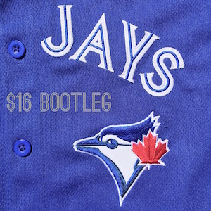
Let's get this out of the way -- the bootleg is the wrong colour. It's too light, and vaguely greenish. It has buttons that are a different colour from the fabric itself. And the fabric pattern, meant to look like Majestic's Cool Base material, is far too coarse.
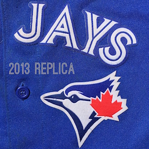
The 2013 replica is the right colour but a different fabric from the on-field jerseys. It's thicker, doesn't breathe very well, and has a bit of sparkly material woven into it to mimic the sheen of the real jerseys. It does a great job of that -- take one of the old-style replicas out into the sun and they sparkle beautifully. They sparkle in a very different way, mind you, but it looks really nice.
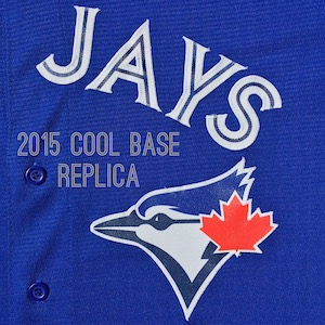
The most noticeable change for 2015 is that the replica jersey is now made of the same Cool Base material as the authentic and on-the-field jerseys. It has a distinct pattern of tiny holes in it and is incredibly lightweight, almost disturbingly so. It also reflects light the way that a projection screen or a bicycle reflector does, which is part of why it appears so vibrantly blue on TV and in pictures. This material is my favourite thing about the 2015 jersey.
LETTERING, PATCHES AND DETAILS
This is the section where all three of these jerseys show their limitations. The 2013 replica has letters and logos that are embroidered onto another piece of fabric and then glued to the jersey. The embroidery doesn't have the same level of detail or three dimensionality as on an authentic jersey. Meanwhile, the bootleg has decent embroidery that stands out from the jersey the way it should. It's missing the three stripes in the white of the blue jay's face, but that's a comparatively small omission when you consider that the colours are wrong. Usually the bird logo has a navy blue beak, eye and back and a royal blue crown, but this fella has royal blue on all sides and a weird navy blue stripe through the middle. To make things worse, the bird appears to be squished, a little taller and thinner than normal.
Bauxites, the logo is not the worst thing about the bootleg jersey.
That honour is reserved for the crooked lettering. I can understand why the 2013 Majestic replica pre-stitched the words Blue Jays to another piece of fabric before attaching it to the jersey -- they avoided the train wreck of spacing and orientation on the bootleg. I've included a picture because it's so unbelievable -- the letter J looks like it has has too much to drink and is trying desperately to stay upright.
The bootleg has one redeeming factor: it has a relatively well-embroidered MLB logo at the neck. It's not enough.
Speaking of neck tags, that's another big difference in the 2015 replica. Up until now, the neck tag has been a way to distinguish, even at a distance, whether or not a jersey was authentic. The new Cool Base replica has a neck tag that has been embroidered onto a small piece of fabric and then stitched on. Up close you can see the difference, but it's nice to have it back there. That combined with the fabric bring the authentic and replica jerseys much closer together. So what's left to distinguish a replica jersey that costs $129 from an authentic one that costs $100 more? The answer is the embroidery and the lettering. Basically, there isn't any embroidery -- the Jays logo and the split letters of BLUE JAYS are printed on to a stiff, shiny reflective material and then stitched onto the jersey. The letters themselves are solid, with the split printed into them (though cleverly, they're printed with stitch patterns). At first I was disappointed by this decision -- fancy embroidery is one of the most fun parts of a baseball jersey -- but over the last few days I've come to realize that the logo is sharper, cleaner and brighter because of it.
FINAL THOUGHTS
From a reasonable distance, the new Cool Base replica is indistinguishable from an Authentic jersey. That's an admirable design goal, and I'm happy to see that small but important details like the neck tag are no longer exclusive to $200-and-up jerseys. And while it's disappointing to not have an embroidered logo on it, because the fabric matches the more expensive jerseys I imagine it would be a lot harder to tell the difference between a Cool Base replica and an Authentic Collection jersey for teams with simple, solid logos. The comfort difference is a big improvement, and I look forward to wearing it up in 518 on one of those blazing hot days this summer. The old replica and this new one make a very different set of compromises, and I like the new ones better. As for that bootleg, I've seen souvenir t-shirts that look more like a real baseball jersey. Hell, my legendary Al Leiter batting practice t-shirtsey was better, and the numbers peeled off of it.
Want to evaluate one of the new 2015 Cool Base jerseys for yourself? Our friends at Majestic Athletic are having a giveaway. Head to Majestic.Giveaway.Deals, enter your information and choose Batter's Box as the referring site -- if a minimum of 100 entries come from us, one of our readers is guaranteed to win a jersey. The contest closes April 30th, and the winner will be announced on Monday, May 4th.
https://www.battersbox.ca/article.php?story=20150419221821105


